Why do maps make Greenland look as big as Africa?
On most world maps Greenland looks as big as Africa, yet Africa is 14 times larger: blame a brilliant 1569 map made for sailors, not for measuring countries.
▶ Start the storyGreenland looks as big as Africa on most world maps because those maps use the Mercator projection, which stretches everything more and more the farther it is from the equator. In reality, Africa is 14 times larger than Greenland. Greenland is closer in size to a single African country, the Democratic Republic of the Congo.
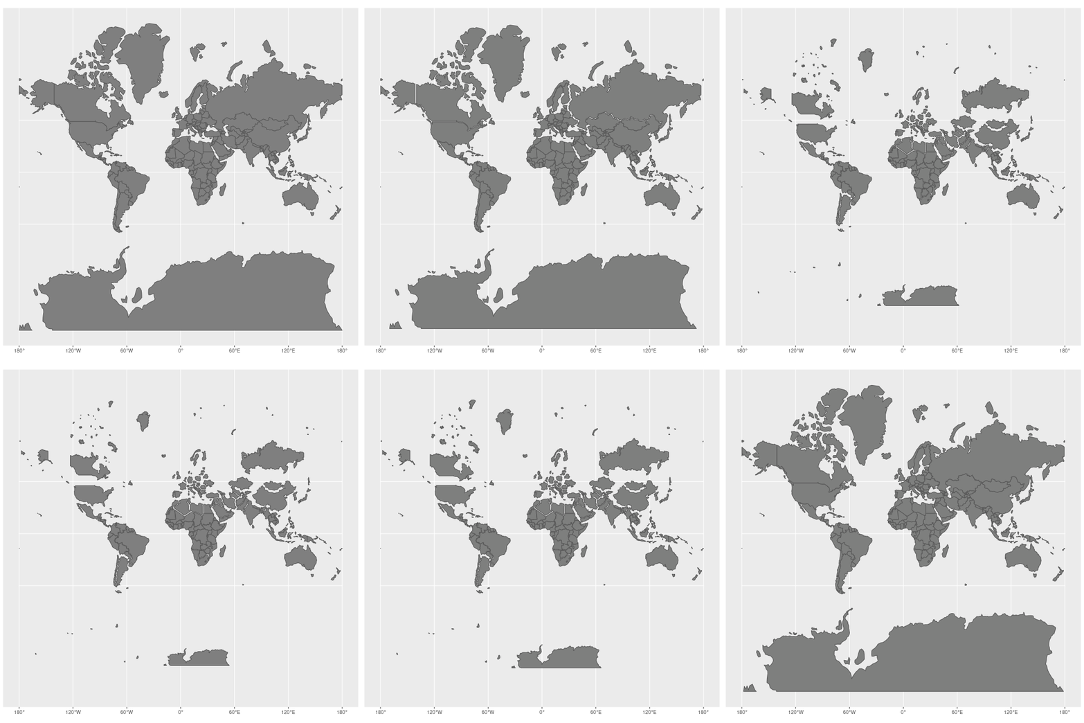
The stretching is not a mistake, it is the price of a clever trick. Gerardus Mercator, a Flemish mapmaker, published his projection in 1569 on a huge world map printed on eighteen sheets, which he called a description of the Earth "corrected for the use of sailors". Flattening a globe onto a rectangle forces the circles of latitude, which shrink toward the poles, to all become the same length. Mercator stretched the map north–south by exactly the same amount, so that angles stay true everywhere. The reward: a straight line on his map is a constant compass bearing, and a sailor can simply follow it.
The cost grows with latitude: Greenland's area is inflated about 12 times, and the poles would be infinitely large, so they are simply cut off.
The projection is still everywhere, because Google Maps and OpenStreetMap use a version of it called Web Mercator. The African Union now backs a campaign for an equal-area map called Equal Earth instead.
Quiz me
0/3
Recap
Mercator trades true sizes for true directions: straight lines are compass courses, but the poles balloon.
Surprising fact · Greenland's area is inflated about 12 times on a Mercator map, and Africa is really 14 times bigger.
Connects to
- 🧭 Why can't a flat map ever get both angles and area right?
- Map projection
- Rhumb line
- Gall peters projection
Sources (1)
No source, no claim. Every fact in this lesson (16 claims) cites at least one of these.